
Do Logos Matter for Your Brand? Part 1
Since I’ve worked in marketing and advertising so long, my brain is programmed to view things from that perspective. But I wonder how often people less immersed in this field think about how a brand’s logo makes them feel. Take a second now and think of the brands you typically purchase at the supermarket or clothing store. Do their logos make you feel anything? Comfort, trust, reliability? Or can you even recall these logos?
Companies spend millions of dollars establishing their brands through a multitude of advertising avenues, and the one thing that connects all these efforts through the various messaging and offerings is their logo. It’s a constant visual element that – if it’s designed well – will stick in consumers’ minds and be immediately recognizable over time. But what do those companies want their customers to feel when they see that brand image?
Our philosophy at Media Results is that people who feel good about your brand will buy your goods or services. Seems simple and obvious, right? But there is a long and thorough process on how to elevate our clients’ image and brand awareness through logo design and other advertising content. So, what are the brands you feel good about? We’ve asked some of our employees to weigh in.
Dan Milone

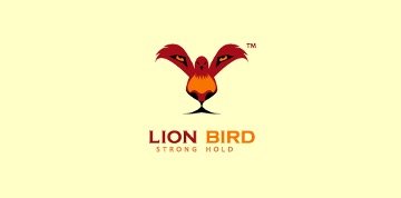
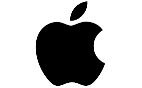
I’m torn. As someone who always wanted to be above the norm, to think outside the box, and never to settle for “good enough,” I love when I see a logo that adds a clever element of a double entendre or hidden message, i.e., Baskin Robbins (31 flavors) or this random Lion Bird logo I saw in an article once. On the flip side, I love simple, recognizable brand logos, like Nike and Apple. Nothing else has to be said and there’s an instant sense of trust that these brands will deliver quality products every time.

Mike MacKenzie

One of my all-time favorite logos is for GM’s brand Saturn (1985 – 2010), designed by Margo Pearson at Landor & Associates. The typography is typical auto branding, based on markings from the Saturn rocket program, but that’s not what I love about it. At its most basic level, the logo evokes a specific planet in an elegantly simple way, using only two meticulously crafted curves. There is a secondary reading of the logo as well – that of a rocket orbiting a planet – again harkening back to the Saturn rocket program that inspired the name.
Dicky Phillips

I always liked Toblerone’s logo, and its packaging. I clearly remember how it always stood out on the rack of other sweets when I was a kid. Not to mention that the letters of the city of origin (Bern, Switzerland) are found in order within the brand name. But the most clever part, especially since “Bern” translates to “bear,” is the image of the standing bear hidden in the mountain. There’s also a bear in the city of Bern’s coat of arms. My grandmother was part Swiss and German, and she was the one that introduced me to this outstanding brand of chocolate.
Way to go, Gram: now I am hooked.
Taylor Crow
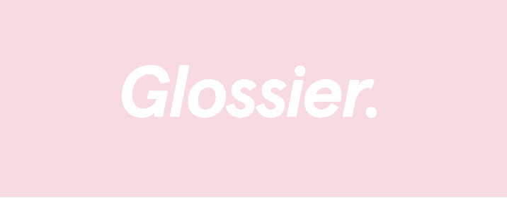
My logo pick is from Glossier, a makeup and skincare brand that I’ve loved for years. I appreciate the logo’s simplicity, but it also offers a dash of youthful fun. It reminds me of a streetwear brand, and I think that’s why I (and many others) choose to buy merch with this logo on it. And for what it’s worth, that’s what I consider the ultimate compliment to a company’s branding. I’m also a complete sucker for their color choice, known colloquially as “millennial pink,” because of my generation’s fixation on that shade. Overall, it represents so much that appeals to me: femininity, natural beauty, and fun.
Mark Saffie

I think the Nintendo 64 logo is one of the coolest logomarks ever. Maybe it’s a little bit of bias since this was my childhood. But the cubed N signifying the new 3D capabilities of the system, as well as the fact that it makes 64 faces and 64 vertices when it’s rendered as a 3D model, shows how much thought went into something that initially seems simple. Also, at that time – the mid-‘90s, the primary colors in the logo (which matched the colors on the controller) really stood out to video game-addicted kids like me… especially compared to the PlayStation 1 or Genesis, which both used more muted, drab color schemes. The branding for this system was definitely on point. Plus, I still have the GoldenEye 007 start-up music pop into my head a couple times a week.
Patrick Lacey
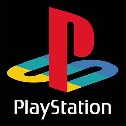
After carefully considering deleting this from my top 3 after reading Mark’s entry (above), I am choosing to double-down with unabashed bias in my choice of the PlayStation logo. No fancy face/vertex symbolism – just vibes. Not to mention that half the logo is dedicated to being a literal floor for the “play” to stand on. I also read somewhere that the colors are meant to represent “joy, passion, and excellence,” which is weird because they used four colors to represent 3 qualities, but who am I to question genius? Immaculate inception to a console. Now if you’ll excuse me, I have a Crash Bandicoot speed-run record to break.
But, for the sake of this blog theme, I do enjoy logos that take the prominent letters of a product and morph them into something that feels like a pure, almost-abstract logo design. The P obviously stands out with this one, but I remember not recognizing the S until somebody pointed it out to me (granted, I was like five, but I still think this idea is solid). The perspective warp on the S to give it a 3D illusion while remaining a proper 2D design is a nice touch. Although the in-console logo was extruded to be proper 3D, I think the official print logo is a nice representation of the new 3D frontier that these mainstream consoles were embarking on while referencing the 2D world their games had to abide by.
Written by: Taylor Crow