
When Minimalism Goes Too Far: Corporate Branding That Has Lost Its Design Personality
By Taylor Crow
In recent years, trendy graphic design minimalism has spread to corporate logos and branding. Apple pioneered the “extreme minimalism” design philosophy, and with the company’s meteoric success came countless imitators. Apple’s approach to design is stripped-down and simplified to the cleanest lines, and much of the premium pricing of their products can be attributed to its design aesthetic. And while it works beautifully for the tech company, extreme minimalism is oftentimes the wrong branding choice for companies today.
We’ll explore a few recent logo changes that have arguably robbed their respective brands of personality and recognizability in an attempt to keep up with the minimalist aesthetic craze.
Animal Planet
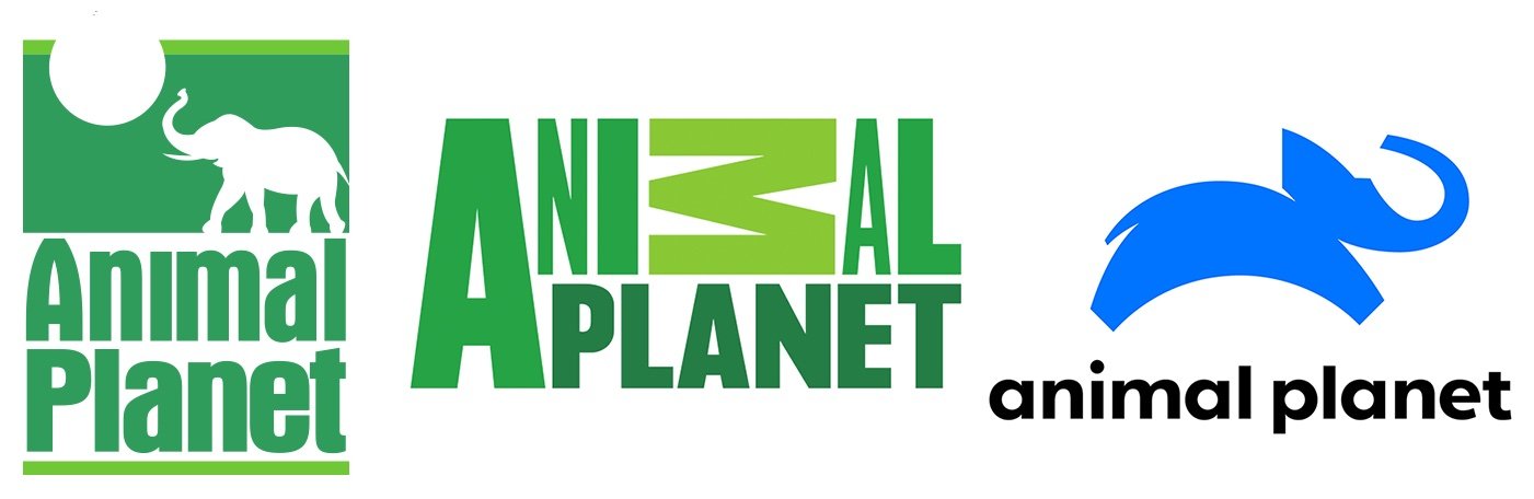
Animal Planet has had a few logo redesigns over the last few decades, but they’ve always emphasized the natural green color palette. This was a great choice in keeping with their brand of wildlife shows; plus, the brain immediately connects these verdant tones to nature. The second image (above) axed the elephant (how’s that for loving wildlife?) as well as the planet Earth graphic but embraced the use of a playful font to still get across their “wild” branding. This was a step toward minimalism, but at this point there was still some recognizable personality; it felt like a logo you’d see in a safari, and this evocation is critical to the logo’s success.
The third image is Animal Planet’s current logo – adopted in 2018 – and it has been met with near-universal disapproval, confusion, and snark from social media users. The switch to a near-neon blue is most baffling to me; while the green fit their brand perfectly, the blue feels like a more eye-straining rip-off of the “social network blue” trend (Facebook, Tumblr, and Twitter have made it the graphic design equivalent of clinical corporate social brands). The font of the new logo is another miss; the flatness of everything robs the logo of any spirit. The oddly shaped “elephant” doesn’t help either, and compared to the first image it feels like a sterile attempt to re-create the past – but with lifeless minimalism instead.
Pringles
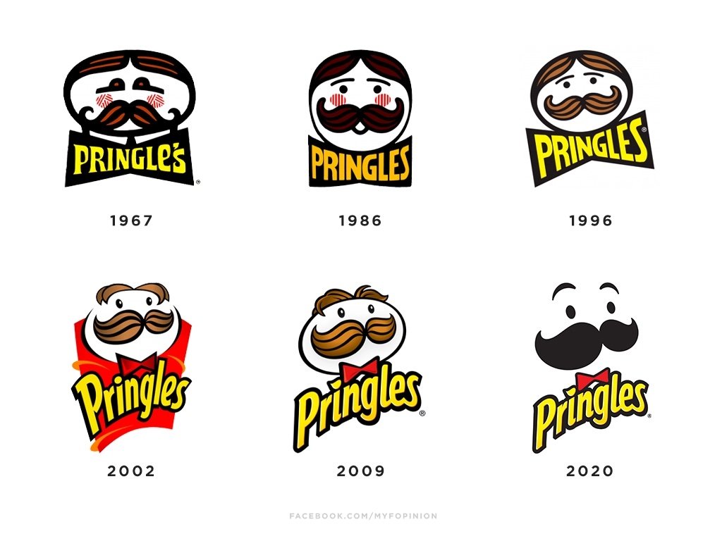
Pringles has had quite a few logos over the brand’s life, and they’ve all featured the iconic Mr. Pringle. Most of the updates have been necessary to modernize the logo as design trends evolved. However, the 2020 redesign falls into the same trap of minimalism destroying recognizability and personality of the mascot. It strips Mr. Pringle of not just his facial details, but his color as well. Perhaps worst of all, they took away the white glint in his eyes, and now the chip-loving man lacks all signs of life. Mix that with the strange placement of the bowtie, and this logo redesign was both unnecessary and off-putting. We demand justice for Mr. Pringle!
Patreon
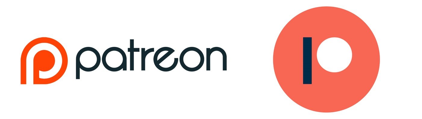
Last, we’ll look at the example of Patreon, the online membership platform. Their icon on the left never did stand out, but at least it did the job and highlighted the orange “P” as the center of their branding. Many people could recognize the website simply with that orange “P,” much like any other successful online business (such as Facebook’s lowercase F). But in 2020, Patreon made the same mistake the other brands on this list did as well: they went overboard with the simplifying. Now, the website is represented by what I can best describe as a blue bar next to an orange circle. They are strangely far apart, and I’d wager few people would pick it apart as a “P” without insight on what it’s supposed to be. There are people who say this is a fresh take on distilling shapes down to their barest bones, but this is a commercial logo whose success hinges on its recognizability – not as an abstract art project.
If people can’t figure out what you are trying to convey, then your message has failed.